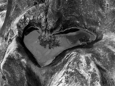
After agonizing for what seems like forever on the five images to enter into the juried show at the Newspace Gallery, in Portland (OR), I have finally decided-- and a good thing, too. The deadline for entries is tomorrow. In addition to the image from the Macal River, (from the "welcome" post), they are...

I called this one "Window" in the submission. It was taken on Cordon Road, in North Salem in February of 2008.The version here is the toned one I submitted. It was originally shot on the B/W setting. I recently printed it and the contrast and composition really popped.

I took this on (or a block away from) Glisan, in Portland in June, 2008. I originally titled it in Spanish (Paisaje Inventado-- Invented Landscape) after Manuel Alvarez Bravo, but entered it with the English title. I'm too self-conscious to be that pretentious.

I often think of the passage in Edward Weston's Daybooks, where Charis, his model and wife, would be driving them through the Mojave during the work done under the Guggenheim fellowship, looking for locations. Edward didn't drive and would occasionally fall asleep in the car. Charis would stop and wake Edward up when she felt she reached what looked to her like a "Weston." This image is not exactly the same, but my wife did play a big part in creating it. We were walking along the Silverton Reservoir and she wanted to skip a stone along the glassy smooth surface of the water. I yelled, no! She laughed and threw the stone. It created the ripples you see. I shot and now must credit her for the creative and collaborative impulse. I called it "radiance" for the entry. Elsewhere, I have just called it "Ripple." I like the way the circular ripple radiates and repeats along the surface, breaking the reflection of the clouds and far bank of the reservoir. I inadvertently had the camera (my Canon G9) on the neutral density filter option, which forced a high ISO speed and the grainy noise you see. This image is on the website.

I call this one "Hostas Leaves" and have already been chastized for the lack of loftiness to the title. I took it just off the steps on our back porch a few weeks ago. There is a monochromatic version, and this tinted version. It was composed and cropped in-camera, with no additional cropping and very little tonal correction. The way you see it is the way it came, practically right out of the box. The simplicity and geometry of it is a close to what I think as perfect as I have gotten. I like the way it looks like it may have been taken three quarters of a century ago. Someone recently asked me what kind of film I use. I told him I don't. It is the image, above and beyond the means of capture, that counts in the end.

